COURSEWORK
26.04.21
LO: to explore possible tasks and research similar products.Brief:
1. Create a front cover and a double page spread article for a hobby magazine aimed at an audience primarily of 14-18-year-olds.
purpose of the product product: to entertain and inform people who enjoy that hobby. Simply to share a recipe.
TA: for the second, children, as we can see from the child-like, informal font and text and the cartoon drawings added, to make it seem more exciting to a younger child. The food suggested, is typically more preferred by a child with a possible age from 5+. In the first, we can see it is for an adult, as it is a more complex design and recipe, with a thoughtful, mature display/presentation.
Research 10.05.21
LO: to research codes & conventions of similar products.
what kind of articles do they include on the front page?
shortened versions of what occurs in the magazine, often the most important/biggest articles.
what is on the cover: objects, activities, models or celebrities
something relating to the hobby. eg. baking magazines often have a picture of baking, someone baking, or something that was made, like a cake. Unless it is a popular hobby like cooking, or gardening, it is unlikely a celebrity will be on the cover.
How is the colour scheme chosen?
usually the same palette as the main image. some depend on genre, like gardening tends to be green, earthy tones. However, white, is typically used as a background on the DPS or in texts.
where is the masthead and what kind of font is used?
usually, the masthead tends to be at the top of the cover, sometimes beneath the main image, if a model/person is featured. Sans serif.
how many images are on the cover?
usually one main image and sometimes small featured corners of pictures/
how many cover lines are used?
3-4
what institutional information is included and where is it placed?
bar-codes, item number, price. at the bottom right of the page.
How many different fonts are used on the cover and how do they vary?
the masthead and title tend to be the biggest, and cover lines are smaller, however still a similar font.
how are puffs used?
how are DPSs laid out?
a large image one one side and large majority of the text on the other side, still with some, smaller pictures dotted.
how many images are used in DPSs?
one main image, other small images. so roughly 5.
How many different fonts are used on the DPS and how do they vary?
4-5 different fonts. They vary from chefs' quotes in bold Sans Serif to the recipe in plain serif. there are larger fonts used to make certain texts stand out.
How is the text organised in the DPS?
in columns, around the images.
Codes and conventions
Hobby magazine genre codes and conventions: what are they and how are they used?
to be quite stylish but informational. so formal colour palettes are used to introduce this convention to the magazine.
Layout codes and conventions: how are the covers and DPS laid out?
4-5 different fonts. They vary from chefs' quotes in bold Sans Serif to the recipe in plain serif. there are larger fonts used to make certain texts stand out.
one example of a cover and DPS:
what house style is established by the use of font/colour/images/layout?
homely, friendly but also luxurious and quality.
production values (are they high, mid or low?)
mid-high. It looks well made, but not as if it was taken in a studio kitchen with expensive lighting. Homely.
What ideology is presented? LInk to target audience
they value using local produce, using exquisite ingredients to make a classy, continental dish that can be enjoyed by various cultures.
How is colour palette and typography used?
formal. Colours matching the food/image are used. Like in this case, dark ,earthy, but simple tones are used (black white and dark browns). The typography and fonts also are simple, no italic, only bold or normal.
How are the people or areas featured represented?
the chefs' featured are represented as experts in this area, they appreciate the food made.
intial planning 17.05.21
Name- Tasteoftoday
Tagline- paradise on your plate
sub-genre- non-fiction, informational
representation- formal but fun, friendly
house style- photography opposed to animated. matching details from cover to DPS. matching font for titles
possible cover lines- can healthy be delicious?
DPS article subject- dips and tricks, different affordable, dips that can b mad by kids
DPS image ideas- ingredients separately, the whole recipe on the other side
design masthead-
the two larger are the ones i'm struggling to choose between. I like number one as its groovy and would appeal to the age range, so i think i might choose that one despite, the 4th one looking fitting for a cooking magazine.
pinterest board- (click link)
24.05.21
In-design 07.06.21
LO: to explore and understand how to use in-design for magazine layouts.
Production 14.06.21
LO: to create content that meets the set brief by creating meaning for an audience of 14-18 year olds.
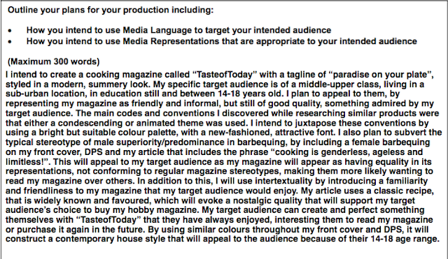
statement of intent 05.07.21
LO:to produce a concise and clear statement.
15.09.21
elements my magazine has:
- original masthead/title
- strapline
- cover price, barcode, edition number
- original images
- coverlines
- feature article
- minimum 5 images
elements my magazine doesn't have yet
- six cover lines
- stand-first
How does my cover follow the conventions of my genre
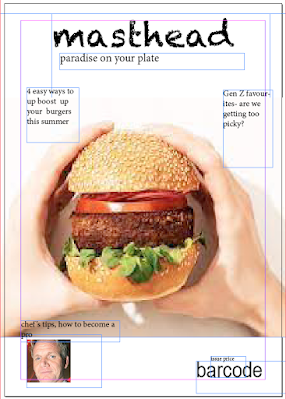
my cover follows the conventions of my genre as it has a person holding a barbecuing tool and wearing an apron. This links to cooking and specifically (with barbecuing tool) burgers, which is what my DPS presents. The summery colours are youthful and exciting, elements that should be introduced with summer cooking, especially burgers, that involve bold, fresh elements that are paired in the colour palette of my front cover. The font is playful and new-fashioned, this lightheartedness symbolises summer completely and the fun cooking activities my magazine presents. It subverts common stereotypes as BBQ food is mostly associated wiht masculinity and a role a father would take, and my magazine represents a female, teenager replacing this role.
How does my DPS follow the conventions of my genre?
my DPS follows the conventions of my genre by the unique layout that fits the experimental quality in cooking. The large image of the burger fits the genre's conventions as it compliments the recipe and introduces a colour/saturation that we would usually see in summer cooking.
to do list:
add more cover lines
make DPS more lively and informal
Final 09.02.22
updated statement of intent:


Excellent research and initial ideas!
ReplyDelete